
Client dashboard – EcoTree
UX Research • Product redesign • Team management
About the company
EcoTree is an European provider of nature based solutions that benefit the environment. Individuals and companies can contribute to the development of forestry and biodiversity projects.
The project
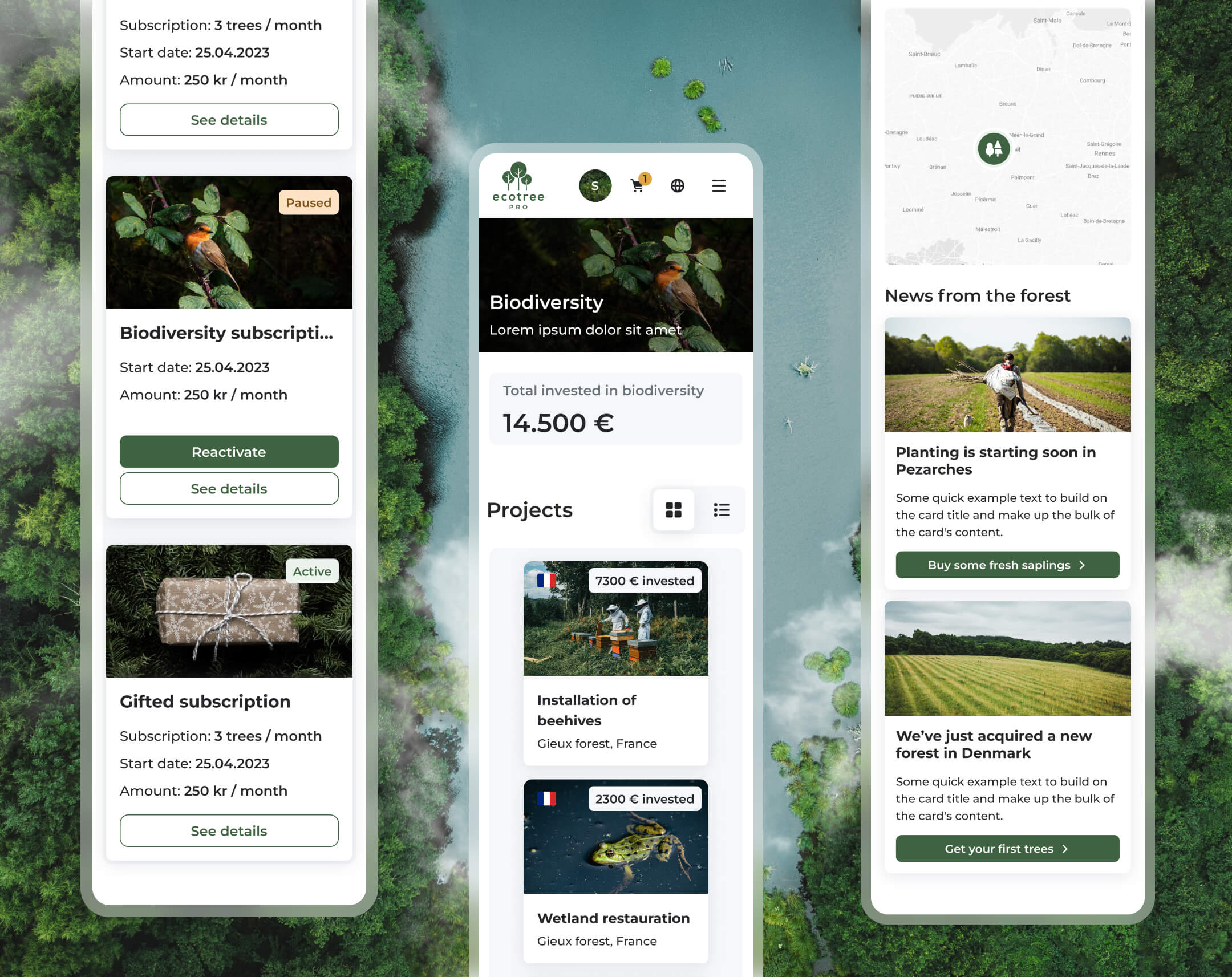
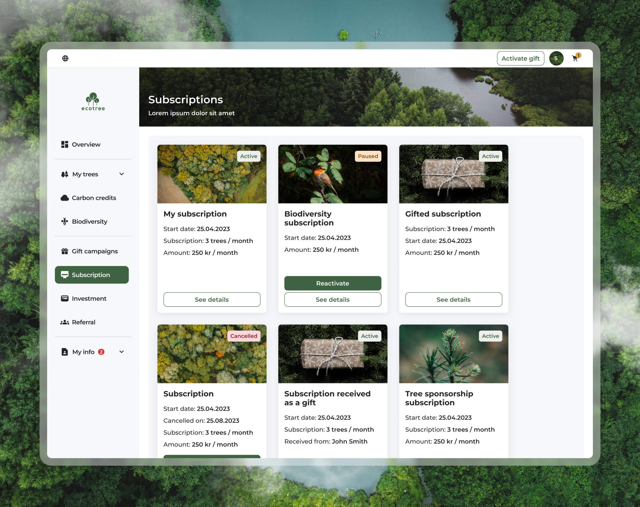
This was a redesign of EcoTree’s user dashboard. The interface provides a central hub where clients can view their purchased trees, biodiversity projects, and subscriptions. It also offers account management options, including updating personal information, managing notification settings, and accessing certificates.
- Business Goal: Enable clients to independently manage all aspects of their EcoTree products, such as viewing and transferring trees, giving trees as gifts, accessing certificates, and tracking their contributions to biodiversity and carbon credits.
- Product Goal: Deliver an intuitive and engaging experience that makes it easy for users to find and understand information about their products, track their return on investment, and manage personal data and preferences. The design prioritises simplicity, clarity, and a sense of achievement in contributing to sustainable initiatives.
My role and the team
For the dashboard redesign, I collaborated with Celia, a Senior Product Designer, and Melina, a UX Intern. While the team was based in Paris, I collaborated mostly remotely from Copenhagen, and from Paris for two weeks, when we organised working sessions. Thanks to Figma and strong team dynamics, the distance never felt like a barrier. I brought expertise in product design and led the overall design direction, Celia contributed her senior-level product design skills, and Melina brought contributions in research and wire framing.
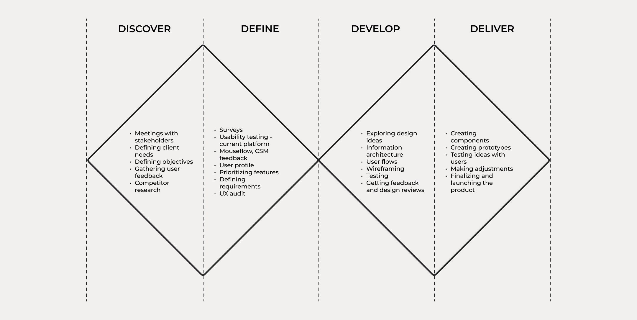
The process: Double Diamond
The Double Diamond model guided the dashboard project through structured phases. In discovery, we aligned client needs with environmental goals. The define phase focused on usability testing and prioritizing features. Design ideas and testing followed in development, and the product was refined and delivered through prototyping and feedback.
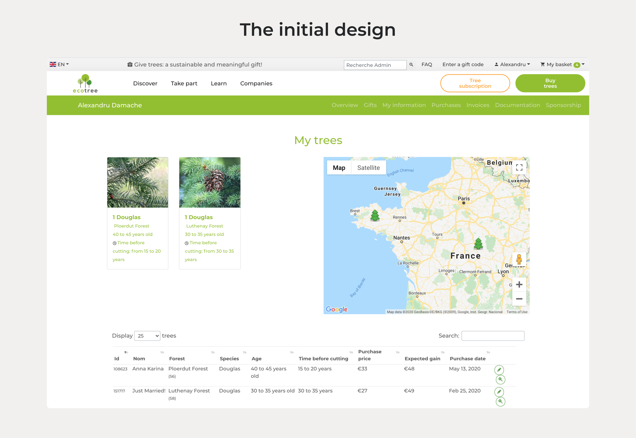
UX Audit of the Old Dashboard
Before the redesign, the EcoTree dashboard faced several issues that impacted both usability and visual appeal. Addressing these challenges was crucial to ensure a more seamless and enjoyable user experience. The main problems that we needed to solve were:
- Outdated UI, various visual inconsistencies, various colour & alignment issues. Needs to be consistent in terms of visuals & interaction principles with the Design System
- Redundancies in the way it was set up. Many ways to do the same tasks and access the same info
- Non intuitive sitemap, people had a difficult time finding what they were looking for
Research
We began the project by establishing a clear understanding of user expectations and best practices for dashboard design. This involved gathering insights from various research methods to inform and guide the redesign process.
- Benchmarking: Analysed common user expectations and industry best practices for dashboards.
- Competitor Analysis: Reviewed competing platforms to identify strengths, weaknesses, and opportunities for differentiation.
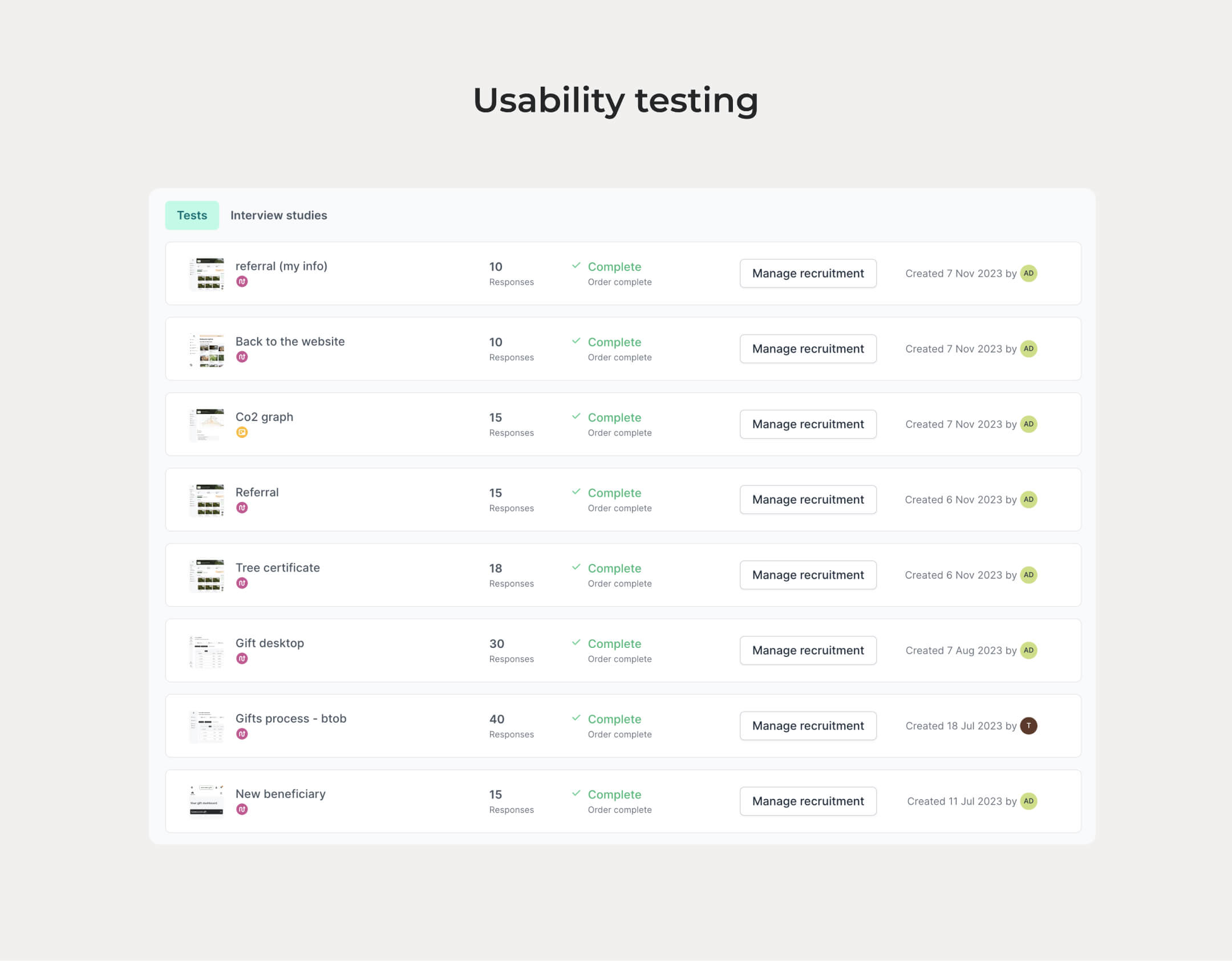
- User Research: Conducted surveys, usability testing, and a UX audit to assess the current dashboard’s performance and uncover pain points.
These steps provided a solid foundation for creating a user-centered design that addresses both functional needs and aesthetic standards.
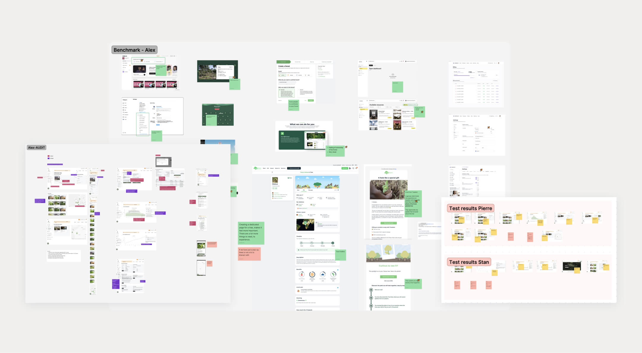
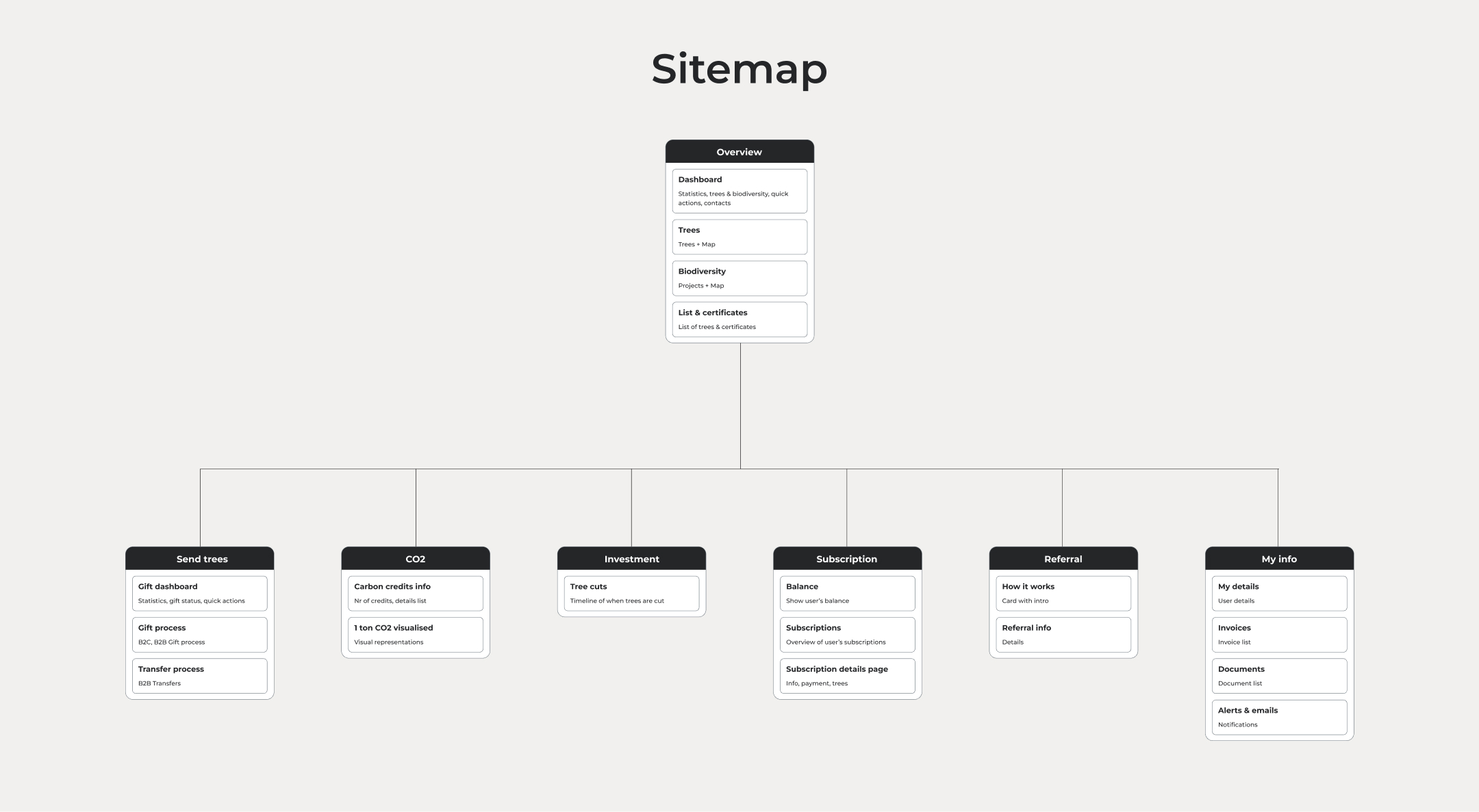
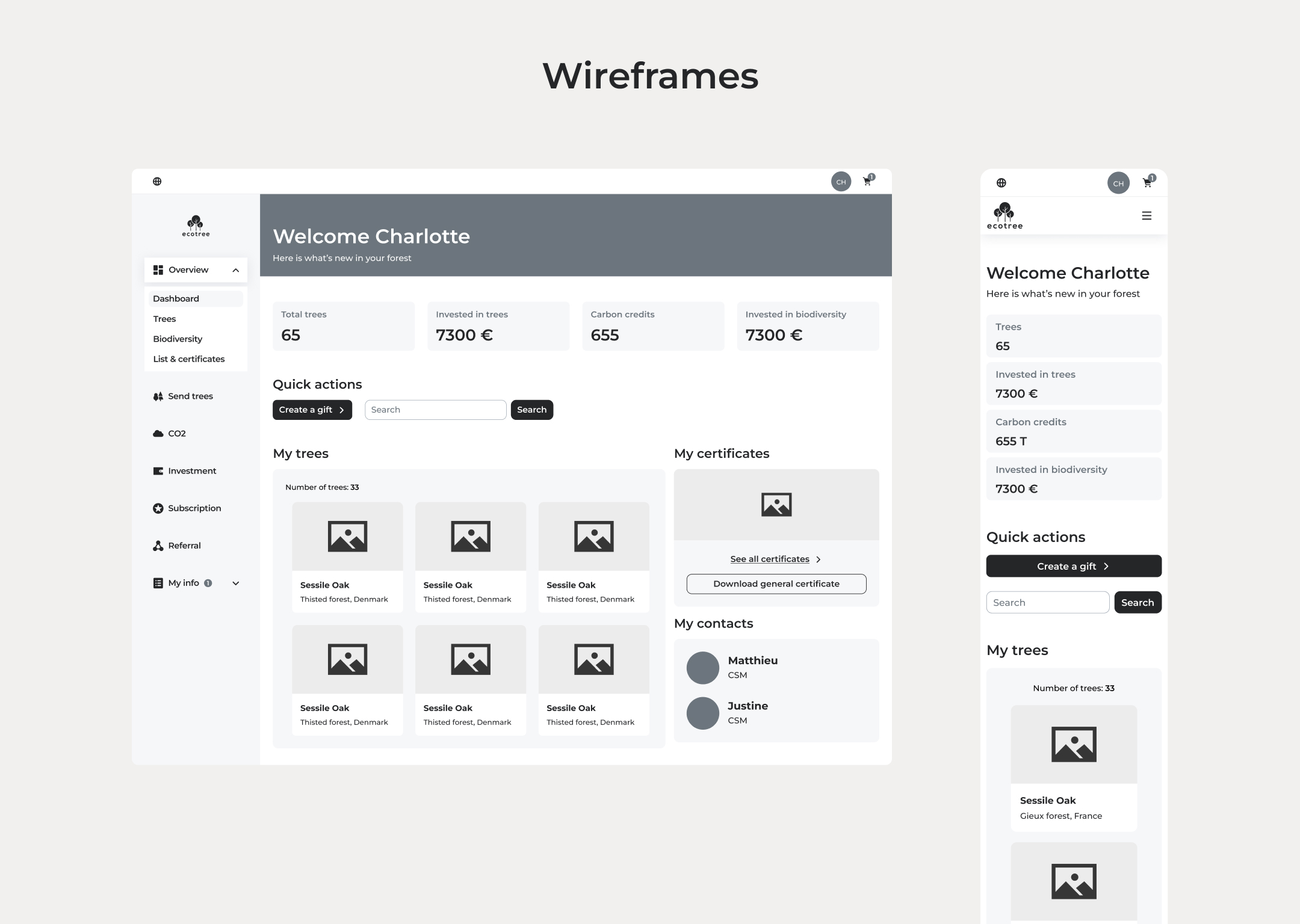
Sitemap, wireframes & idea testing
We concluded from the testing, that the menu was not intuitive enough to find everything that the users needed. So, we’ve made a new sitemap and re-organised the information.
In order to see if we made the right decisions, we’ve done a cart sorting test and created wireframes to do prototype testing. We iterated until we reached good results in the tests.
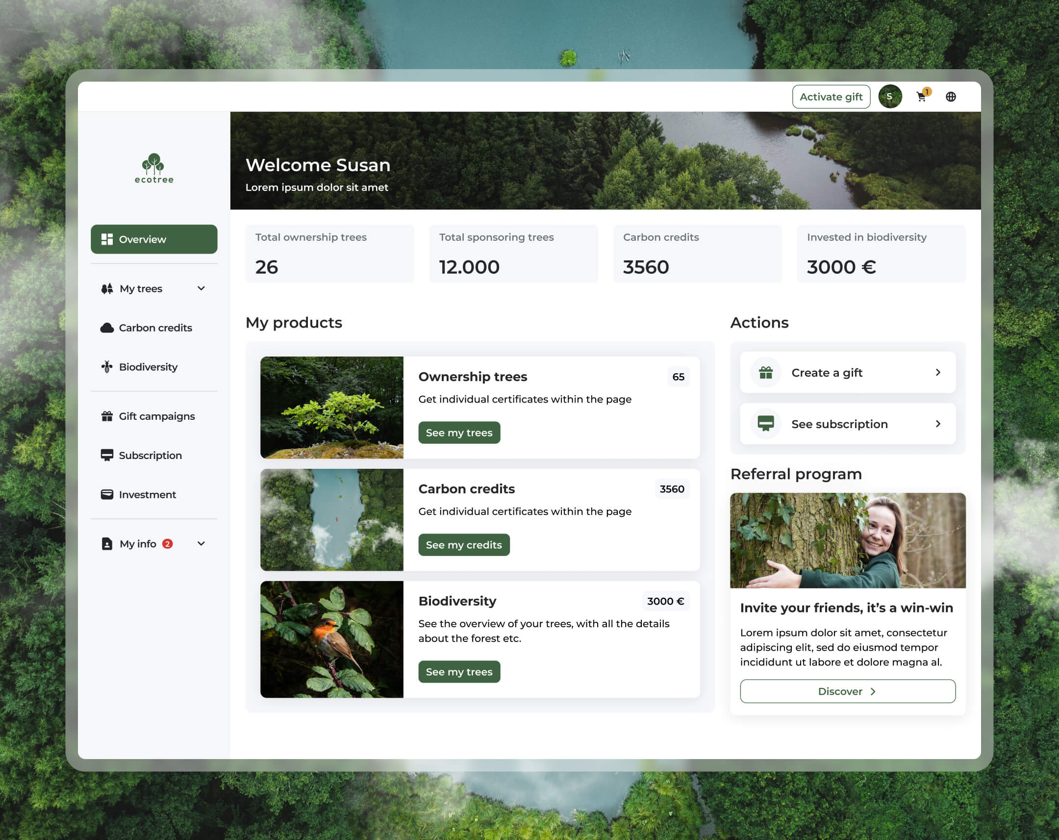
Design
The UI design was built upon the Design System established the year prior, ensuring consistency across the screens and aligning the dashboard’s visual language with the style of the landing pages. This alignment addressed a key request from the project brief while fulfilling an internal objective to create a cohesive experience.
- Design System Integration: Leveraged the established Design System to bring uniformity to visuals and interactions.
- Improved Usability: User testing showed significant improvements, with participants finding it much easier to locate information and complete tasks.
- Delightful Experience: Feedback revealed that users were not only satisfied but genuinely delighted to use an intuitive, polished, and aesthetically pleasing dashboard.
- Internal Recognition: The final product received enthusiastic praise internally, with managers and team members agreeing it was the best product we had ever delivered.
Seeing the final design come together was a rewarding moment—a “breath of fresh air” where every piece of the puzzle fit perfectly, resulting in a product that excelled both visually and functionally, leaving users and stakeholders highly impressed.
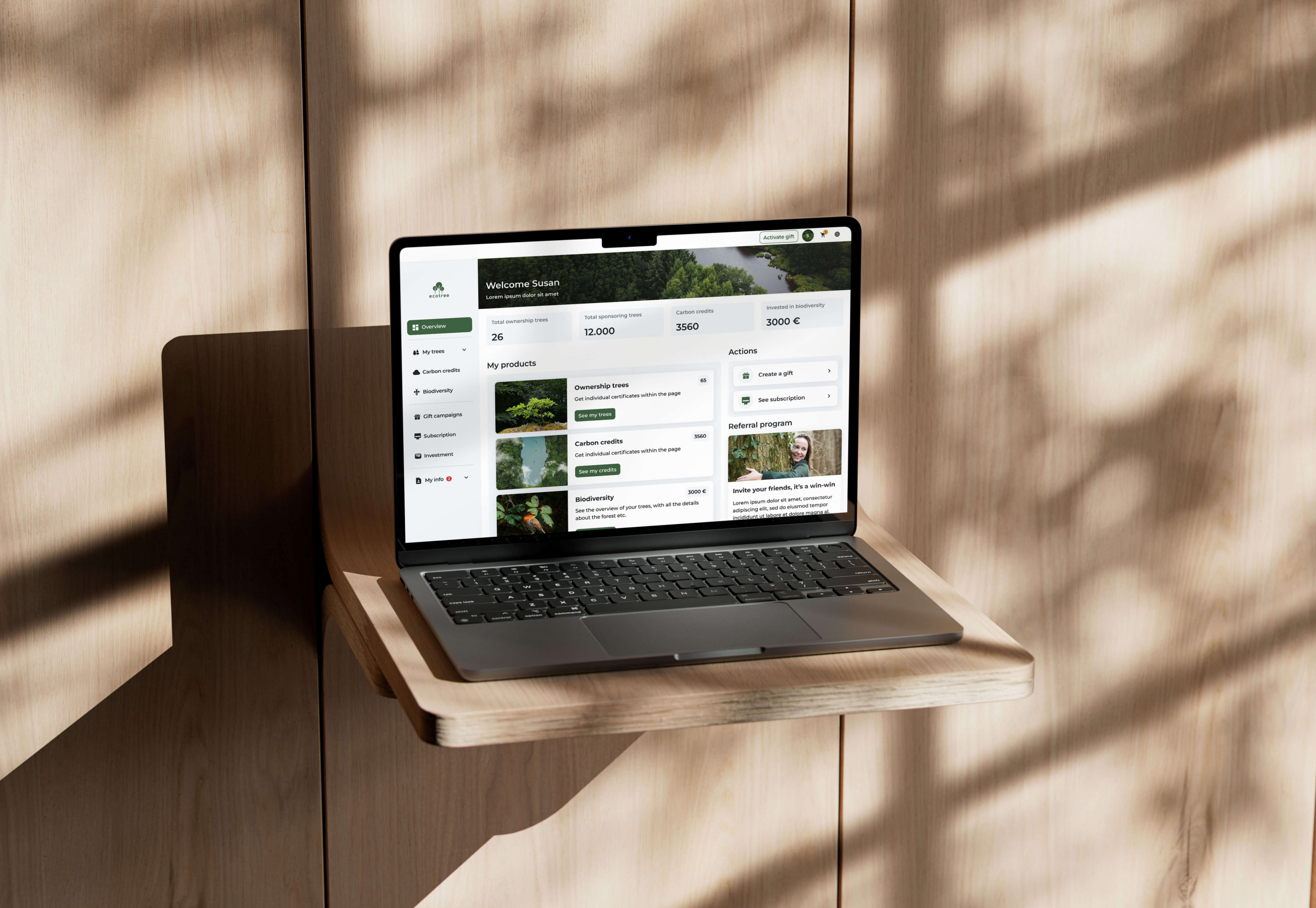
Implementation & the prototype
This dashboard design aims to simplify client interaction and management. While it’s only 50% implemented, working closely with the development team on this project has been incredibly rewarding. We’ve made great strides together, learning and growing throughout the process. Key highlights include:
- Collaborative Implementation: The development team and I have worked closely to ensure the early stages of the design align with our shared vision.
- Learning and Growth: Despite being only partially implemented, our collaboration has sparked continuous improvement and innovation.
- A Professional Milestone: This project has already become one of the most fulfilling experiences in my career, showcasing the power of teamwork and dedication.
See below for a preview of the interface in the YouTube video below, where you can see how the design simplifies client interaction and management.

Impact
While the design is currently 50% implemented, we anticipate significant improvements in user engagement and task efficiency once the full solution is live. Initial user testing has shown that participants complete key actions 30% faster due to streamlined flows, and feedback has been positive regarding the intuitive navigation and clean interface.
As implementation continues, we aim to improve account management satisfaction and create a more engaging and educational user experience. We will track success through metrics like task completion rates, user retention, and satisfaction surveys post-launch.
Thank you for your attention!