Gift process – EcoTree
UX Research • Product redesign • Team management
About the company
EcoTree is an European provider of nature based solutions that benefit the environment. Individuals and companies can contribute to the development of forestry and biodiversity projects.
The project
This was a redesign of the tree gifting process on EcoTree’s website. The flow allows users to give trees as a gift and generate a personalized gift card with an activation code for the recipient.
- Business Goal: Enable clients to complete the process independently, reducing reliance on customer service.
- Product Goal: Deliver a seamless experience that provides clear status updates on the gift, ensures users feel confident throughout the process (with the ability to correct mistakes), and makes the experience enjoyable.
My Role and the Team
As Head of Design, I worked with Celia, a Senior Product Designer, and Melina, a UX Intern. While the team was based in Paris, I collaborated remotely from Copenhagen. Thanks to Figma and strong team dynamics, the distance never felt like a barrier. I brought expertise in product design and led the overall design direction, Celia contributed her senior-level product design skills, and Melina played a crucial role in research and wireframing.
UX Audit of the Old Gift Process
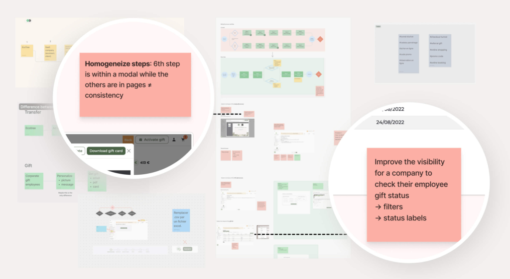
To kick off the redesign of the gifting flow, we conducted a comprehensive UX audit of the existing process, aligning with the first phase of the Double Diamond methodology: “Discover.” This audit helped us identify and define key problems to address.
The old gifting process presented several challenges:
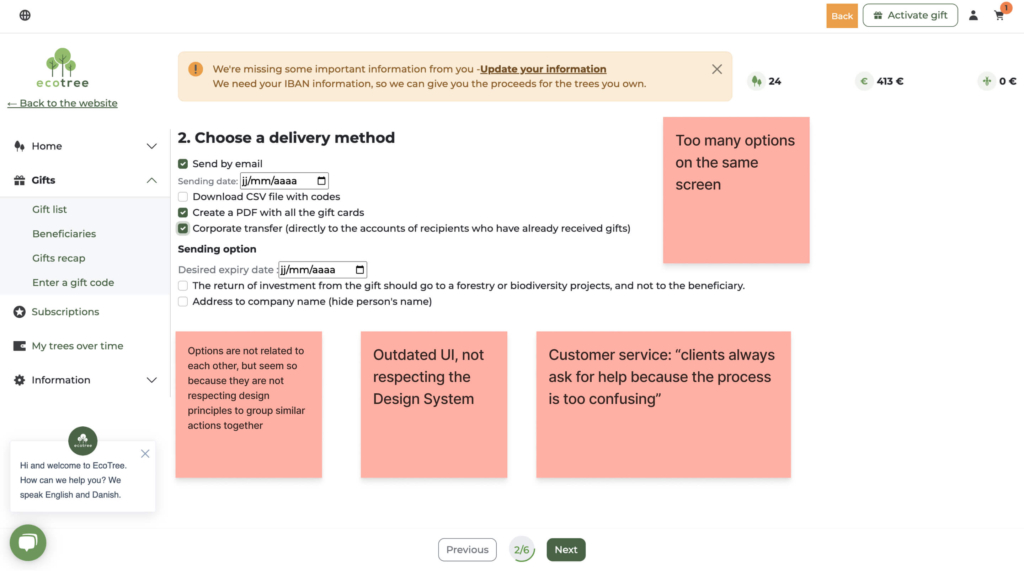
- Too many options on a single screen: Users found it overwhelming to make decisions due to the lack of focus and excessive information presented at once.
- Poor grouping of actions: Options that weren’t related were grouped together, breaking established design principles and causing confusion.
- Outdated UI: The interface lacked alignment with the design system, leading to inconsistencies and reducing the perceived quality of the experience.
- High reliance on customer support: Clients frequently sought assistance due to the unclear and confusing process.
This audit was instrumental in setting a clear foundation for improvement. It helped us define pain points and prioritize them for the redesign, ensuring the new solution addressed users’ needs effectively.
Benchmark
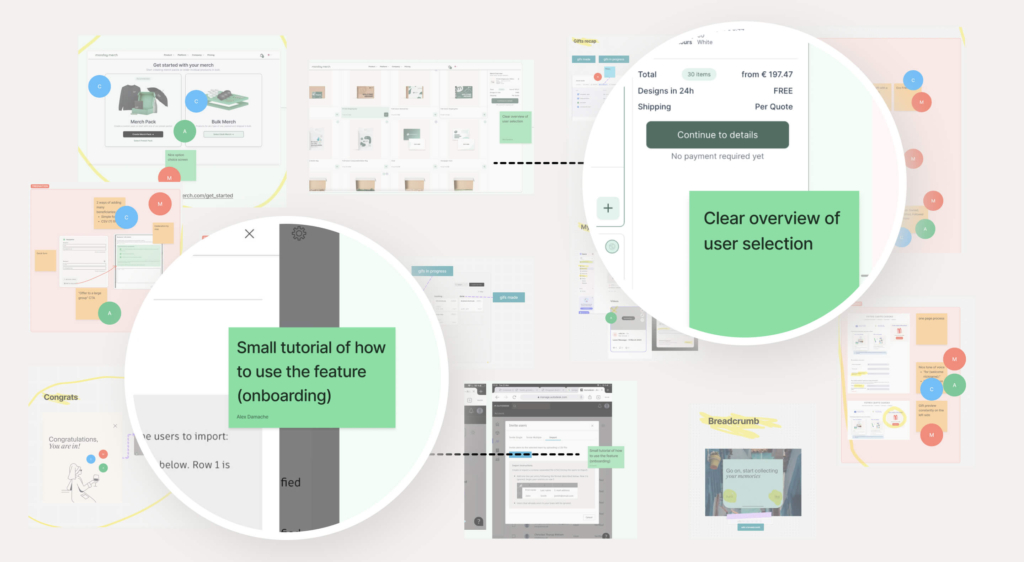
We analyzed platforms with gifting and e-commerce flows and also drew inspiration from apps like Duolingo, known for their simplicity and ease of use on both desktop and mobile. Key takeaways included:
- Simplified workflows: Breaking down processes into single, clear decisions per step to reduce user overwhelm.
- Feedback on choices: Displaying clear overviews of user selections to reinforce confidence and reduce confusion.
- Save and return functionality: Allowing users to save a draft and pick up where they left off later, making the process more flexible and accommodating.
These benchmarks helped us design a flow that felt intuitive, flexible, and easy to navigate, regardless of the device.
User Flow
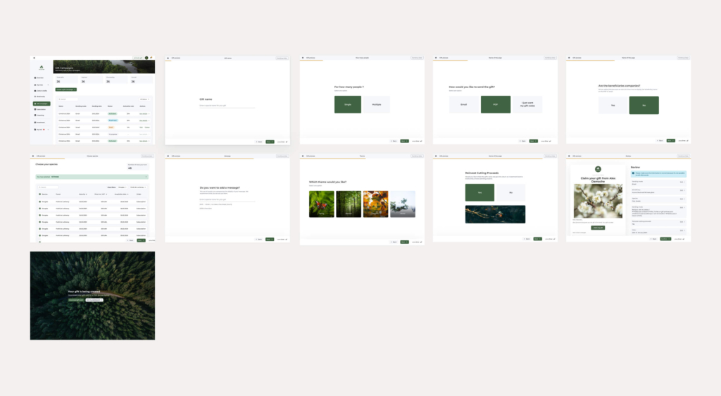
The new user flow was designed to make the process feel effortless and logical. We broke it into small, digestible steps, where users only had to make one decision at a time. This was a major shift from the previous process, which crammed multiple choices into each screen. Here’s what the new flow looked like:
- Select the tree, delivery options and if it’s for one recepient or more.
- Personalise the gift by adding a message, a picture and a name.
- Preview the gift and make edits if necessary.
This step-by-step approach not only made the process easier to follow but also gave users confidence at every stage, as they weren’t bombarded with too much information.

Wireframes
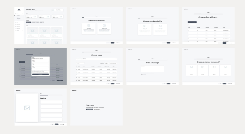
Melina and I translated the new user flow into wireframes, focusing on keeping each screen clean and focused on a single task. Some key design choices included:
- Dedicated screens for each step to reduce decision fatigue.
- Clear progress indicators to show users where they were in the process.
- Simple layouts with prominent calls-to-action to make navigation seamless.
Together, we reviewed the wireframes and provided feedback to ensure they balanced usability with the necessary functionality. The result was a series of screens that felt intuitive and uncluttered.
Design
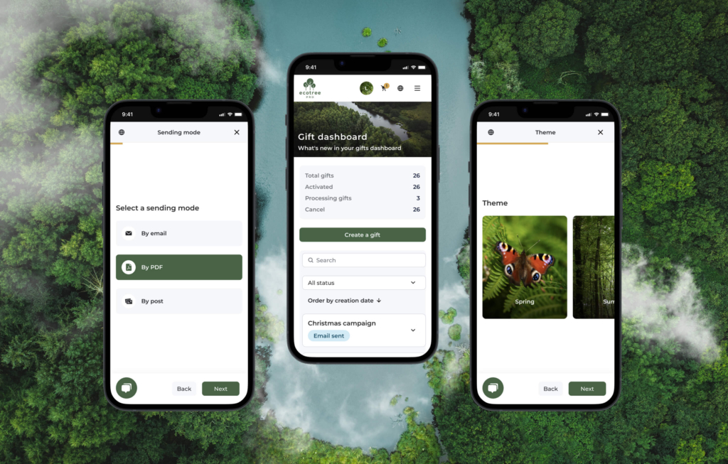
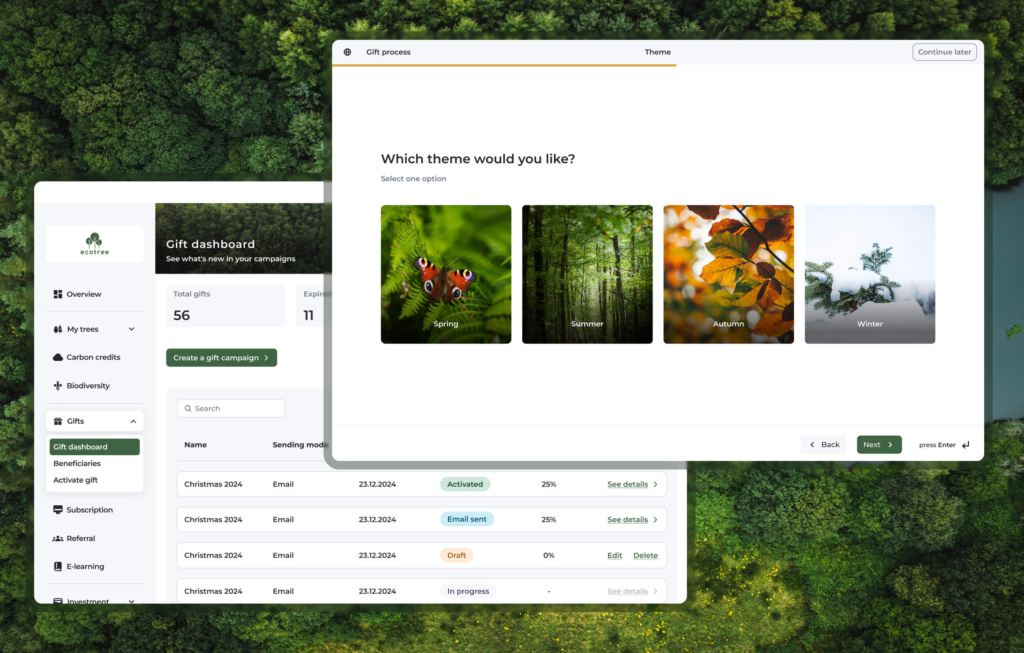
When it came to the visual design, the focus was on keeping things simple and welcoming. We wanted the interface to feel approachable while staying aligned with the new flow. Some highlights of the design:
- Clean, minimal layouts, based on the Design System, with a clear focus on the primary action for each step.
- Nature-inspired visuals to connect with the concept of gifting trees.
- Subtle animations and micro interactions to make transitions between steps feel smooth and polished.
- Responsive design to ensure the experience worked seamlessly across devices.
Celia and I worked closely to refine these designs and ensure they reflected user feedback from the earlier stages.
Key New Features
The redesigned gifting flow introduced two major innovations that significantly improved the user experience:
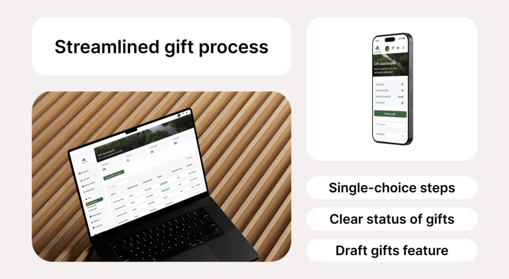
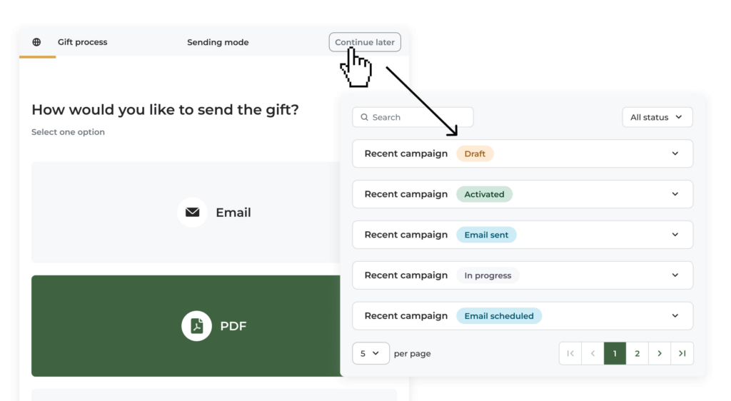
- Draft Mode with “Continue Later”: Users now have the ability to save their progress if they don’t want to finalise the gift immediately. This feature ensures that partially completed gifting processes remain as drafts, allowing users to seamlessly pick up where they left off at a later time. This flexibility empowers users to take their time without losing their work.
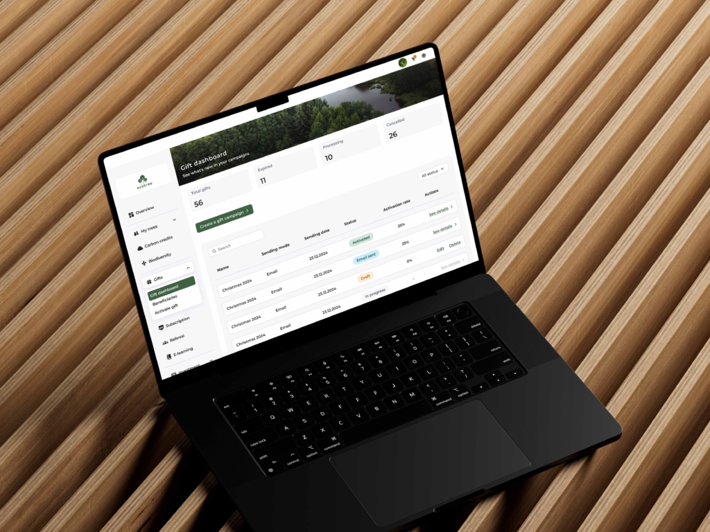
- Gift Status Dashboard: The updated dashboard provides a clear and transparent view of the gift’s progress. Users can easily track the status of their gift at any stage, with updates such as: “Email is sent”, “Email is scheduled”, “Gift has been activated by the recipient” & of course “Draft”.
These enhancements not only improve usability but also reduce uncertainty, providing users with greater control and confidence in the gifting process. Both features represent meaningful advancements, setting a new standard for how digital gifting experiences can be managed and tracked.
Live implementation
We launched a live version of the process, and it’s being actively used by real people. A screen recording of the actual flow will showcase how it works seamlessly and validates its success. This project highlights the strong collaboration between myself, as Head of Design, and the development team, ensuring smooth implementation.
- Clear, single-choice steps: Users find the process much less stressful and more intuitive than the previous version.
- Progress indicators: These provide a sense of control, showing users how far they’ve come while keeping the focus on the current step.
- Personalized gift preview: Offers assurance by showing users how the final gift will look and gives them the ability to go back and adjust earlier steps if needed, enhancing their sense of control.
The final result is a live product that works as intended, delights users, and doesn’t require customer service intervention—a huge success for both the design and development teams.
Impact
The redesign had a significant impact on both user satisfaction and operational efficiency:
- Simplified user experience: Users loved the new “one choice per step” design. It made the process feel effortless and enjoyable.
- Increased independence: The number of customer support tickets related to tree gifting dropped significantly, as users could now complete the process on their own.
- Higher engagement: The improved flow and gift preview feature made the experience more engaging and personal, encouraging more users to complete their purchases.
This project was a true team effort. I provided the environment for everyone to freely express their opinions, including designers and developers, so that everyone could make a mark on the project and in the end have a gift process that we’re proud to show to the world. Together, we transformed a confusing, overwhelming process into one that felt simple, thoughtful, and user-friendly.
